
Our goals on the seamless purchase squad were to reduce friction, drive growth and sales and improve the ordering experience across platforms (desktop and mobile). As part of this initiative, we decided to investigate opportunities in the add to cart purchase paths on the site - including the product information pages, product landing pages, special buy of the day, appliances, custom blinds, and more.
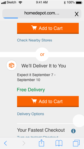
I conducted a competitive review and audit of Home Depots' mobile experiences, then created a series of add to cart design options for mobile web for our team to test using test and target. I've included a couple of examples of designs we tested below (there were several mocks, use cases and logistics in this project). As part of the testing, we planned to measure the order completion rate and the attach rate for add-on features such as recommendations, protection plans, assembly, etc.
Unfortunately, the test and target ran into several development issues with the way the add to cart experience was coded, and were unable to complete the test.
Based on the benefits of the new add to cart drawer that we designed for desktops, (ie. scalability and scannability) we discussed revisiting the next steps for the mobile test and target to focus on the drawer versus a more simplified approach.